Podcast

Vimla launch – interview with Katarina Gospic

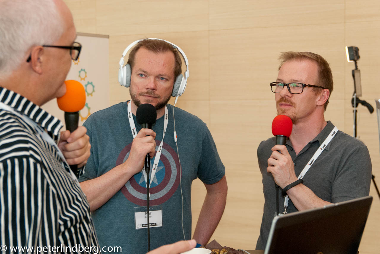
UX Podcast attended the launch of Vimla, a new mobile network in Sweden that aims to be simple, open, and community driven. We talk to Katarina Gospic, brian scientist and beta tester of Vimla about her experience as part of the Vimla focus group and her ideas for the service.


Vimla launch – interview with Johan Littorin

UX Podcast attended the launch of Vimla, a new mobile network in Sweden that aims to be simple, open, and community driven. We talk to Johan Littorin, head of Vimla, about how the idea was born and how they are working with user-centered product development.


#69 James & Per & The Dirt Show

UX Podcast in Sweden stretches across 6000km of Atlantic ocean to join up with The Dirt Show in Boston for a crossover show. James and Per from UX Podcast along with Steve, Mark and Tim from The Dirt Show quiz each other about how UX and web development in the US and Europe.

Read More

#68 James & Per ask: money or meaning?

revrise-banner

Are you in it for the money or in it for the UX? James and Per reflect on Facebook’s $19bn purchase of Whatsapp, the history and future of messaging and personal correspondence as well as how the start-up ideology you adopt can affect your approach to UX.

(Listening time: 38 minutes)


References:


#67 James & Per & Anna talk deliverables

UX deliverables with Anna Dahlström. We look at the problem with UX deliverables, explore being tactical and adapting what you produce to the situation, dabble with mentoring and find time for a “fika”.

Read More

#66 James & Per stunt UX

A Link show. James and Per discuss three recent articles found during their digital travels. Has information architecture been hindered by the rise of user experience? What is user experience? and finally how do you make sure that users don’t accidentally delete things?

Read More

#64 James & Per are web-safe

A Link show to start the year. Per and James discuss three recent articles that they’ve found during their digital travels. With font-face now widely supported how much thought do you need to put into your font-stack? How do you go about adding personality to your website or product? Finally we take a look at some of the top UX predictions for 2014 and even share our own thoughts on the coming year.

(Listening time: 51 minuters)

References:

#63 James & Per recommend podcasts

Whilst sat around an open fire drinking sherry and wearing Santa hats, James and Per record a podcast about podcasts. In this meta-show we explain how podcasts help us in our work. What is it that makes us like a podcast? What kind of challenges do podcaster face in producing awesome shows? Finally we recommend a bunch of podcasts that we listen to and explain why you should give them a try.

Pour yourself a glass of something nice and enjoy the last UX Podcast show of 2013.

(Listening time: 49 minutes)

References:

#62 James & Per are delightful

In this linkshow James and Per discuss 3 articles they’ve found during their digital travels. We start off by discussing customer experience landmines – things (from the experiences of a non-uxer) that can be hurdles for your customers. In the middle of the show we get delightful and discuss  adding delight to your ux. Finally we peel back the buzz and look at working with touchpoints.

What do you think? Email us at uxpodcast@uxpodcast.com

(Listening time: 40 minutes)

References:


#61 James & Per & Costas grumpily innovate

Costas Papaikonomou is The Grumpy Innovator and author of Thoughts from a Grumpy Innovator as well as one of the founding partners of the Happen group that specialises in helping organisations transform their innovation success rate.

Read More

#60 James & Per & Jonas fill in forms

Web forms and form analytics. We’re joined (once he’d found the right garden!) by Jonas Arnklint from Stockholm-based start-up Revrise to talk about web forms.

Read More

#59 James & Per suck up leaves

Why do we produce so much content, and so many websites and apps, that people don’t want or need? We take a look at the problem of bloat that so many information rich (non-transactional) sites have. How did our sites end up this fat and irrelevant?

Read More

#58 James & Per & Mattias have beards

We meet up with Mattias Beijmo, founder of Duma and course leader for Web Management at Berghs School of Communication for a chat about beards. After the facial hair chat out of the way we ask Mattias how, back in the 90s, he got into the web branch.

Read More

#57 James & Per avoid spinning

Episode 57 of UX Podcast is a link show. James and Per discuss three articles found during their digital travels.

We start off with some satire and discuss a humorous article about top carousels, a conversation that evolves into a reflective discussion about culture and native languages. The middle article focuses on navigation design patterns for responsive sites and apps – specifically the “left navigation fly out”. We finish off with a look at a post by Luke Wroblewski about how you should avoid using a spinner to indicate when something is happening or loading.

(Listening time: 34 minutes)

References:

Transcript:

Per: Hello and welcome to UX Podcast. You’re listening to me Per Axbom.

James: And me James Royal-Lawson.

Per: And we’re sitting in our favourite place at the Clarion Sign Hotel.

James: Our favourite place?

Per: Favourite place in town for recording.

James: You’re right.

Per: I think right now. Yeah.

James: And they actually just tweeted to us.

Per: Yes, it’s fantastic. We say we were going to record here and they tweeted us and said good luck.

James: Yeah. See, some people have got their eyes peeled for customer interaction.

Per: They’re pretty good.

James: And today is going to be …

Per: A link show.

View the full transcript

James: A link show – to dive straight into what we’re going to do today. We haven’t had a link show for a little while because we’ve had Conversion Jam and a few interviews and things. It felt like I want to talk about some of the great content that people produce out there.

Per: We want to hear some of our own voices more as well.

James: Oh, your ego Per. We were just discussing. We got three articles coming for you and it’s a bit of a design pattern thing to these three. We were just trying to decide a little bit on running order – because we do actually plan a little bit before these shows. I was bringing up the fact – the article that we are going to talk about first …

Per: Is now …

James: Yeah, it’s a little bit humorous and Per suggested, it was good idea to finish on a humorous note.

Per: Peak end theory.

James: Yeah.

Per: Yeah.

James: And I said, “Well, maybe it’s good to begin with a humorous one.” Are we trying to keep listeners to the next show or are we trying to keep them to listen to this show? So if we make you all laugh now at the beginning, then maybe you’re more likely to listen to the whole show and if you laugh at the end, you will maybe like listen to us next time.

Per: Right. So if you seriously believe that we’re going to lose or gain listeners based on the running order of our links in this show, then give us a heads up.

James: I like to think that we have some content strategy for this. So the first article.

Per: The first article.

[Music]

James: Which touches on one of my favourite pet subjects, carousels, banners, sliding banners on the webpages which all of you who listen to the show regularly will know that we’ve talked about a few times and you will probably also know what we think about them, which is not very much. An article – I think you actually brought this one to my attention.

Per: Yeah, because I thought of you straight away when I saw it, of course.

James: It’s excellent. It’s actually a satire piece. It’s humour. It’s written to take the mickey out of carousels and the way in which we end up having carousels on websites.

Per: Right. It’s written by a guy called Stephen Hay from California but he lives in the Netherlands actually and well, he’s one of us dudes or guys and he has a blog called The Haystack and that you will find the post Carousel-Based Web Design and he’s trying to make a case for how excellent carousels are.

James: Yeah.

Per: And calling it a new technique and showing how carousels can be used for really communicating the key messages.

James: And they solve all the world’s problems and …

Per: He even has the acronym CBWD for carousel-based web design. That’s a new technique that we should all employ actually.

James: Exactly. “It’s easy to remember. It can help you please your clients for giving them more opportunity for publishing trivial content in less space. It saves money by eliminating tiresome considerations like content relevance and importance, accessibility, and website performance.”

Per: Oh, and this is pretty good actually. “At the end of the day, users don’t just want to get the information they want. They want an experience. We know this because we present statistics in such a way that they support our opinions on these matters.”

James: It’s an absolutely wonderful satire piece.

Per: Yes, it is.

James: Now, it takes all the points that you know are true about carousels, why they don’t work, what’s the flaws in them and so on and reverses and pushes them out as a serious sounding piece defending carousels. Now, that you kind of realize very quickly when you read this article. I thought …

Per: Yes. But if you’re not a native English speaker, then satire and sarcasm and irony are not a given.

James: Yeah.

Per: So the first comment actually is …

James: Well, actually just back a little bit. I got to the addition because he has actually updated the post. So when you’re reading it …

Per: Oh, yeah, that’s right.

James: When I read it, it was a day or so after it has been released because you tweeted me and he has written, “Just to be on the safe side, this article is sarcasm. I do not advocate using carousels. Read that again. It pains me to have to point out the obvious” and so on and so on.

This was where I was almost crying with laughter. I’ve read the whole article and then at the end of this fantastic satirical piece, he still had to point out that it was a joke and I started to think – I was thinking about kind of Americans maybe not understanding satire as well as maybe British and all this kind of clichés, stereotypes. Then after that, I actually went back much later to read the comments. I think you pointed out again to me, “Read the comments, read the comments.”

Per: The first comment is a really, really long comment outlining why carousels are bad.

James: Considered, carefully written. It’s well-written.

Per: Yes.

James: Rodrigo.

Per: Murillo.

James: Murillo.

Per: Yeah.

James: Yeah.

Per: And he’s right of course but the sad thing is of course that he didn’t understand that Stephen was making …

James: It’s a blog post in its own right, this comment, and it’s good.

Per: It is.

James: And do you want to read Stephen’s reply to Rodrigo?

Per: Oh, yeah. “Hi there, Rodrigo. No, I’m certainly not taking your comment in a bad away. If we ever meet, I will buy you a drink. In fact, unless your sense of humour is dryer than mine, you just spent about 15 minutes typing out why you agree with me. Yours is a valuable comment.” They are in complete agreement but I mean Rodrigo misunderstood the sarcasm.

James: Exactly. For a moment there, they thought they were on opposite sides of the war.

Per: Yeah.

James: Because satire is difficult.

Per: But it also brings up the case. I mean how many people out there actually do think that Stephen has a case for making carousels? It’s something that organizations should use. I think there are people out there.

James: Or rather what kind of experience has Rodrigo had in his life as a web.. digital person or whatever that has made him react so instantly and thoroughly to this? He must have had several situations where what Stephen has written has been true for him.

Per: As we all have actually.

James: Yeah. See now that’s the key to good satire. They’ve taken the situation which is kind of – you’ve taken this to the extreme but at the same time you’ve made it kind of convincing and believable. But not only important points about carousels but also just – I think you were like saying about language and how easy especially now when we have so much skydiving that happens. You get a link. You find a link and you dive into a website. You read the content on a single webpage. You possibly don’t even read the header.

Per: No, exactly.

James: You definitely read the About Me page or about-this-website page. You land on some content.

Per: You have no idea about who the author is.

James: No. You look at the words. You look at the words in the middle of the article and you read it from start to end especially if it’s a well-written, thoughtful piece like this one. Then you feel like you want to respond. It’s only then that you …

Per: And also I mean yeah, actually Rodrigo also replied.

James: Oh, that was actually excellent.

Per: Yeah, and he reread the post of course. He has a good laugh and he was a bit sad that the joke had to be explained and …

James: A bit embarrassed, yeah.

Per: Yeah. “Maybe I’m letting carousels drive me way too mad” and I really feel for him because I feel the same. When you see a post like that, you instantly – it’s like that XKCD cartoon where it says, “Honey, come to bed.” “No, I can’t. Someone on the internet is wrong,” which I completely agree with. I’m always sitting up, trying to correct people’s mistakes when I think that they are like way out of order.

James: But you’re right. You see the carousel and you think this is an organization that doesn’t do the full job. They’re not close to it. They don’t measure. They don’t understand what they’re trying to do. They’re not going forward as they should do. But I think what really warmed me about this is that Rodrigo didn’t delete his comments.

Per: Yes, exactly.

James: He left his embarrassing – well, his well-written, 15-minute epilogue comment. He left it there and I think as a series of four posts, with Stephen’s original post, the first comment, response, and then the humble, “You’re right. I’m sorry. I’m a bit embarrassed. What a great post and thanks for this.” Makes an excellent series of – it’s a story.

Per: Yes, it makes a story.

James: It turns content into a story.

Per: It’s a great piece of history.

James: Yeah.

Per: I should print this out and like put it in a book. Yeah.

James: Yeah. So hopefully we’ve made you laugh with that, with our humorous first article.

Per: Well, at least you should go read the post.

James: You definitely read the post. It’s well worth doing it.

Per: Right. Moving on.

[Music]

Per: Our buddy Alexander Skogberg on Twitter has written a post. He has actually redesigned his blog recently. I like it. He has also gone for single column.

James: Oh, yeah, there we go.

Per: So the title of his post is Stop Placing the Men Button in the Wrong Corner and the examples he’s using, the screenshots is from the Facebook app, and I believe it’s on the iPhone. Yes, it must be.

James: Yeah, it’s talking about the navigation pattern for apps and responsive websites. It’s often – the hamburger to the top left.

Per: Right. So you all know the hamburger menu, the three lines, pushed together.

James: We talked about it a fair bit in an article at the end of last year, beginning of this year, I think.

Per: Wow.

James: One article with all those 10 design things.

Per: Oh, yeah, right. Yeah, exactly.

James: On Android often it’s three dots vertically positioned rather than hamburger …

Per: Because I don’t like the hamburger menu but that’s me.

James: No.

Per: Why don’t they just say menu? Anyway, you click that and it’s in the left top corner.

James: On the Facebook app …

Per: And that actually brings out a left hand navigation which is sort of the menu for Facebook.

James: Yeah, Facebook itself slides the other way and reveals a menu to the left.

Per: So what he is really criticizing here is that it’s in the top left so it’s hard to reach and also that it moves. So the location of the menu button actually moves when you click it, which is also bad. I agree with him because I feel it’s quite hard to reach in a lot of cases as well. What I thought of instantly was now that sometimes I hold the iPhone in my left hand and then it’s actually not too bad because I’m using my right hand, because I’m right handed, to do other stuff. So, since it’s my second screen off, then I’m eating with my right hand and then using the phone with my left hand. So that actually may be a use case where it would be good to have it on the left side. Also as you pointed out, I think …

James: I’m left handed.

Per: You’re left-handed. Oh, yeah.

James: So instantly reacted in saying it’s not that difficult. Like so many left-handers, I do do a lot of stuff the other way around too because it’s a right-handed world. So as a left-hander, you grow up getting yourself used to right-handed things whether it’s putting – as a kid, I remember putting coins into – putting money into the – when I get on the bus. You throw the money into the little collector to pay for your bus journey.

Per: Oh, yeah.

James: And the way that is meant you had to have your coins in a certain hand or it just didn’t work. It kind of got all out of sequence. But I think for me, yeah, the whole top part is kind of quite difficult. But using two fingers, while using one hand, another hand, quite often works or you can use the thumb and stretch right across.

Per: Exactly.

James: Top left or top right I think I’m – it’s awkward anyway.

Per: Exactly.

James: When we’re talking about the four-inch or three and a half to four-and-a-half-inch, maybe that kind of size of device. We’re talking about the mobiles, smaller mobiles. I say smaller mobiles now. God, listen to me. A couple of years ago, we wouldn’t have even dreamt to say that a four-and-a-half-inch was a smaller device. Then I think what we’re talking about there with the top area being difficult to reach is true.

Per: Right.

James: And I was at Luke – actually Alexander references Luke Wroblewski in the article and I was at his workshop at UX Lx.

Per: Oh, yeah.

James: Where we discussed this with zones that were easy and hard and OK. And it’s complicated.

Per: It is.

James: It’s not actually a black and white solution to this mainly because of the fact that the screen – a certain pattern solution is valid for a certain range of devices, size of devices.

Per: And for certain use cases as well.

James: And for certain use cases and left-handedness or right-handedness.

Per: Because when I’m watching a movie on my iPad when I’m lying down on the couch, the iPad is rested on my tummy which makes it hard to reach the buttons in the bottom for some reason. I don’t know.

That’s the use case where actually if you have a movie app, don’t put the buttons at the bottom. Put them at the top because that’s where my fingers are.

James: Well then, if you’ve got a phablet or you’ve got one of these five, six-inch devices, then suddenly you can’t use that top area with one hand. You’ve got to use two hands.

Per: Right.

James: So again, different parts of the screen become easier and hard depending on what size you’re at. It’s different for the phablets which are different to the desktop which are different to mobile.

Per: Right.

James: But what’s Alexander’s solution? What does he suggest?

Per: Well, he suggested the top right.

James:You see, I don’t buy it.

Per: Yeah, exactly. I realized that after I actually posted that link to that site. He suggested the top right and the interesting thing about this is that Apple has redesigned the app for iOS 7 and they put that …

James: Facebook.

Per: Yeah, sorry, the Facebook have redesigned it for Apple iOS 7 and then actually put the button in the – down in the right hand corner, which is actually what we’re saying is – would probably be the best place for it if that’s the button that you’re using the most.

James:They’ve read Luke’s post and presentation.

Per: Yeah.

James: And interestingly, Android, that’s where they used to have the buttons a couple of years ago like Gingerbread. My first Android phone, it actually had a hardware button but the menu button was at the bottom right or maybe middle depending on whether you had HTC or some other one.

But bottom was where you got your menu and iPhone became so popular and really kind of picked up and everyone started standardizing their apps across platforms, so iPhone, Android. The apps converged in their design patterns and we saw the advent of the hamburger or the three dots to indicate a menu and often to the top left or top right, especially top left. So it’s fascinating now that – well, we’re starting to see that the easy zone for one finger or thumb navigation is at the bottom of the screen for the smaller devices.

Per: Right.

James: So I don’t agree with Alexander. I think top right isn’t much better than top left. I agree with his point maybe that sliding out is not necessarily a good idea and that dropping down so that your screen, your original state remains visible. I think maybe keeps a better context maybe.

Per: Right. Sliding out I found recently is a pain especially on the iPad. I use the Gmail app on the iPad and sometimes I slide out the menu. But I still see all my emails and when I click the email, nothing happens and I’m wondering – it’s behind but I’m not realizing it’s behind.

James: Yeah, yeah. It sounds …

Per: Yeah, exactly, yeah.

James: I think another thing I don’t actually – and I’m shooting from the hip but animations are GPU-heavy. So by having a sliding action, you’re using more graphical power whereas if you’re just overlaying or dropping or some kind of partial animation, maybe that’s easier on your processor or battery or whatever.

Per: I have no idea.

James: I’m shooting from the hip with this one.

Per: It’s interesting. I mean you need to at least research that.

James: Yeah.

Per: So that’s a good point.

James: The reason why I thought of that is in my head now when I’m thinking of these fly-out menus and swiping and so on, I mean there are times when things lag or they – you get a slower – you click on a menu and it doesn’t come out at the speed you expect because something else is going on with the telephone as well. So it kind of drags its way slowly across the screen.

Per: Right.

James: Because the effort of moving all that content, rolling it across the screen, takes a bit of power.

Per: It does.

James: In some devices.

Per: In some devices, exactly.

James: Little stars everywhere in this.

Per: In some slow devices.

James: Sorry. Have you upgraded an iPhone 4 to iOS 7?

Per: I wouldn’t want to do that.

James: Oh, my wife did it.

Per: Oh, OK.

James: Yeah. She’s not happy.

Per: OK.

James: Yeah, sorry. That’s an aside. So well, conclusion from this one. I think it’s a good article and good point.

Per: Yes.

James: Good that someone is raising these things all the time. We got to keep testing. We got to understand and learn.

Per: We need to be talking about it. We need to realize that there are places that are better than others and it’s not black and white. I mean you can’t decide for every app that it’s always top right or something like that but you need to really think about what’s the most important buttons you have on the screen. How are people using it? Are they like me having breakfast, even though they’re right-handed, having the sandwich in the right hand and the phone in the left hand and stuff like that?

James: And this is crucial as well for responsive that your responsive design, you may set visual breakpoints based on the content. I want the site – this one looks better here. Let’s put it there.

Per: Right.

James: But you’ve got to remember about size of devices and sometimes, resolution doesn’t equal size of device.

Per: Exactly.

James: Because as we know, a lot of devices, when you use the standard responsive of doing width 100 percent, so you force the browser to zoom the content to device width which is not pixel width. You might have a five-inch device but you’re showing a 360 or 400 and something pixel wide, point wide website in the viewport.

Per: Right.

James: Maybe a different navigation would work. So it’s complicated.

Per: I’m actually designing a website right now which is responsive and when it gets down to phone sizes, it actually puts the menu in the bottom. Then I’m testing that in November so remind me to get …

James: What are you basing it on? Viewport or you’re basing it on something else?

Per: I’m basing it on viewport.

James: We should test and have a look and see whether that gets a range of devices and see how that behaves on some of the phablets, some of the other things, a range of things and see whether the way which …

Per: Exactly.

James: … it spreads itself to the fit still makes it feel like it’s the right navigation pattern.

Per: That makes it really hard because like I said, I’m testing it in November. But I mean how many devices can you really test with users? It’s impossible.

James: Yeah, yeah.

Per: You need to make a lot of assumptions and you need to test them.

James: Oh, I think I talked about a little while ago in a show. You’ve got to set up a way of working and a way to go forward where it’s not a delivery and finish. You’re going to have – with responsive now and the multitude of devices, you’ve got to keep on analyzing, keep on testing, be prepared to tweak and change and maybe add breakpoints or change breakpoints over time as you learn more about your site usage or the site usage changes.

There are devices released now which weren’t here a year ago. So if you’ve got a year – there are such things as year-long web projects. If you’ve been in it for a year, when you started your project, it’s not the same as it is now.

Per: Exactly, yeah.

James: Someone has pulled the rug from under you.

Per: Yeah, you need to be changing it all the time. You need to make it as flexible as possible and you need to make your team working on this stuff as flexible as possible.

James: You got to be open to iteration and budget for iteration. Shall we move on?

Per: I have so much stuff I’m thinking about talking about now. I have no time.

James: I think we probably should move on.

Per: We move on.

[Music]

Per: OK. We’ve talked about him a bit today earlier.

James: Yeah, Luke again. Well, not Luke again but he’s coming up again.

Per: Luke referenced again.

James: Yeah. But this time, it’s actually his.

Per: Luke Wroblewski on his blog LukeW.com. He’s talking about spinners and what …

James: What are they?

Per: What are they? I think they have lots of different names

James: Yeah, I think they do.

Per: And I forgot the most common name now of course. You can …

James: Well, loading indicator is one of them.

Per: Right, yeah. And if you search for loading indicator in Google, you will find out all the other names as well.

James: Probably. It’s just a visual indication that something is supposed to be happening.

Per: For some reason, this sort of flower thing, the circular thing – well, sort of almost like a sun, seems to be the most often used one.

James: I mean we used – well, a little while ago, before – I think before mobile really kicked off, it used to be the hour glass which used to turn – sometimes I think the percentage. It used to turn upside down.

Per: Yeah. Wasn’t that Flash or …

James: Flash or Mac or something that was kind of an hourglass that rotated and counted up and then rotated. Well, that was desktop.

Per: Exactly, yeah.

James: Yeah. I think Windows had just an hourglass. But now there’s some kind of spinning flower petal thing. It has been very common and I think Android now, it’s a round ring where it kind of phases aaround. It kind of something – or the petal going around. It’s like – it’s doing travels around this ring.

Per: Oh.

James: But it’s the same concept. It’s a circle with something altering around it. What Luke is saying here is basically avoid the spinner. Loading indicator, something telling you that something is happening, is a bad thing.

Per: Exactly, and the reason for that is because everyone is using it.

James: Yeah.

Per: So you were seeing the same pattern that – you’re seeing the same type of loading GIF indicator, circular thing moving. One is thinking, if you have the experience that OK, when I see that, something usually takes a long time to load. If someone else uses it, even though it doesn’t take a long time to load, they’re going to think it does.

James: Exactly. This is lovely psychological behaviour. We’ve now associated that symbol with slowness. So what Luke is saying here is irrespective of how fast your website is, if the spinner comes up, people perceive …

Per: Your brain says “slow”.

James: Yeah, there’s something in your head that goes, “Oh, slow.”

Per: Yeah.

James: Which is fascinating that we’ve already built up that kind of association. Between this design pattern and that psychological response.

Per: Yeah.

James: And the thing there is that yeah, you’ve got to make your app either so fast that you really don’t need to worry about the spinners. But given variance in mobile bandwidth and other kinds of things and I suppose there’s always a risk that you’ve accidentally ended up on a GPRS network or …

Per: And you have a blank page which you never want.

James: Or you’re going through a tunnel and your page does take a long time to load or something. Then you’ve got to indicate something.

Per: Right.

James: But I mean thinking about my own responses to spinners, one thing I noticed – and this is me as more kind of geek level I guess, is the amount of times when there are animated GIFs and have absolutely zero connection with what’s actually happening.

Per: Oh, yeah, true.

James: So I kind of just get frustrated by the fact that they’re not even trying to communicate something decent to me. Someone is pushing out – they’re printing a GIF, the animated icon to the page. Then going off and doing something and forgetting to come back and maybe getting rid of it or tell me that well, actually, what we want to do, we can’t do.

Per: Exactly.

James: Instead of just leaving me the spinning GIF there and letting me realize that actually my connections died and I need to stop the app or restart it.

Per: It’s a really important distinction that it’s not a progress indicator. It’s just an animation.

James: In some cases, it’s – likely it’s an animation rather than a progress indicator.

Per: Usually it is nowadays.

James: But I think it feels like if you do have a situation where you need to indicate progress, then I think it’s pretty important that you do actually indicate progress.

Per: I would think so, yeah.

James: Rather than do the cheap kind of con, of just here’s an icon. We will get rid of that when we’re already.

Per: Well, especially when it does take a longer time perhaps than 15 seconds. Then you would want a progress indicator.

James: Yeah. What did Luke recommend?

Per: I haven’t read it all.

James: You haven’t read it all! We’re talking about it. I’ve read it and I know. I will save you on this one Per. He talks about skeletons screens as one way.

I think this is one that he mentions but the skeleton is one of the way he says to do it where rather than have a loader, you would leave I suppose – I mean you would recognize it as almost like wireframe-like. You leave maybe a grey box where a picture should be and while that image is lazy loading or is kind of catching up, you leave a grey box there and then just put the image in when it’s ready.

This is good for page – efficiency for page performance point view as well because you’ve designated a space for the image using height and width and so on, which means the browser is enough to do a redraw.

Per: Right. If you’re doing it correctly, then yes.

James: Yes. So not only is this a good way of avoiding a spinner and getting the page ready and out there and ready to interact with. It’s performance-wise good as well.

Per: Exactly. He’s actually talking about the app he’s involved with, Polar, one of his own apps.

James: Yeah, his own products.

Per: Yeah, and he has the example. But what you said about the previous article was that animation takes a long time and it puts a load on the CPU as well and this is actually an example of where you’re using animation to indicate progress. But hopefully in a good way, the way you described it just now that you’re actually creating a placeholder for the content that’s just about to appear.

James: Yeah, I think that’s a good way of doing it because I don’t think you’re creating an overhead there. I think you’re making good use of the natural – the sequence of events that happen when the page is loading. Now using the skeleton concept is a good way of implementing that.

Per: Right. I actually did have this exact challenge recently in my project which is why I love that you actually picked this article and I thought of the normal, usually the Ajaxload GIF thing that people always have and I thought that well, people are going to think that we’re going to wait a while now and usually that’s not the case.

But sometimes I also know that time is perceived differently based on different stuff. So you can actually – if you make it fun to wait, then hopefully people won’t perceive it as taking a long time.

If you don’t use that animation but using animation like a flower growing or a dog eating food or something like that, then that’s more fun to watch than the spinner and then you would actually have something that perhaps people would accept that yeah, every time something takes a bit longer than usual, I will see that fun stuff and you could actually have different things as well.

James: I just sort of now have an example. Don’t lose your thought but I just remembered a funny example which my kids love as well. On the Wii, the original Wii, if you’re installing an app from the app store, there’s kind of a Mario sequence that comes up, it’s like 90s old school graphics. Mario runs across and he runs across the screen and he comes – he loops around. It’s a platform game. He jumps up and hits a box and he opens up and leaves the coin and it kind of goes ding-ding-ding.

Per: Right.

James: He collects the coins. So it’s just a fun little animation, real simple graphics. But my kids love it. If I ever install an app, they come running in and going, “Oh yeah! What’s Mario doing? What’s Mario doing?”

Per: That’s beautiful. Just as well as we’re talking about micro copy, this is a type of micro interaction where you have the possibility of making something more fun. It’s like an error message. You have the possibility of making something more fun.

I think in our conclusion there is don’t rely on what other people are doing because that can backfire if people actually experience that something is taking longer than usual even though it isn’t. Try and tie it in with your brand, something that makes it more fun, and then people will actually enjoy waiting for a bit.

James: I think the spinner is a good example of a design pattern that’s cheap and easy. You can just throw it out there without any thought whatsoever whereas the underlying issue is actually a bit more complex. Thinking as well about – I’ve got a few apps that I use where they use a spinner but when I’m on a 4G connection or a really good connection, it’s so fast, that you end up with this kind of flickering, it flickers. Was that a spinner? It just kind of – it’s like a subliminal advertising. I have this vague memory that there might have been a spinner there. It actually just disrupts. It’s a loose cannonball. It kind of shimmers because the …

Per: Subliminal messaging, yeah.

James: You’ve got to understand what’s happening and there’s going to be metrics and there will be – you learn, OK, this is a point where we know – because we’ve tested. We’ve measured. It’s probably going to take us not 0.6 seconds for this to happen. Generally. Then you can take the decision about what kind of indication or example that you’re going to use to fill that gap where it’s skeleton lazy loading and so on or where it’s a spinner or an animation or whatever you think of. But if you find good research that generally no, it’s so instant, maybe you don’t need to worry.

Per: True. Actually, when I redesigned my form contact form on my website three years back or something, I had a loading indicated because the form is Ajax-submitted and I realized just as you’re saying, it was too fast. It didn’t have time to load the indicator. So what I did was I actually put in a pause. So it never was faster than two seconds because that gave it time to actually see something is going on and it’s finished, done.

James: Exactly.

Per: Yeah.

James: Yeah, you’ve got time to take in the sequence.

Per: So you actually delay it on purpose for the sequential items that are happening which actually makes sense in your head.

James: Yeah. Right, that could be a sensible thing. As long as you keep it within the magical 0.1 seconds or whatever for response, then that maybe is a sensible thing to even your interactions out, if you’re lucky enough to have everything so fast. Maybe you spread things out a bit, to give people time to visually absorb what’s going on.

Per: It’s like having white space.

James: Yeah.

Per: It’s having white time.

James: Yeah, white time. Oh, I like that.

Per: Yeah.

James: That’s good.

Per: Oh, wow.

James: I’m done.

Per: I am too actually. I’m off to a meeting.

James: It’s Friday afternoon and Per has a meeting.

Per: Oh, yes.

James: It’s one of those really cruel things that people schedule meetings for quarter past three on a Friday afternoon.

Per: Yeah, it’s crazy.

James: They love you.

Per: They do. They just want to meet me. OK. As always, remember to …

James: As always, you mess it up. We used to be good at saying these endings.

Per: I know.

James: What happened?

Per: Why is this so hard? I need to get a new tagline.

James: No, don’t start doing that on me because you won’t remember to say the new one.

Per: That’s right. Remember to keep moving.

James: And see you on the other side.

Hide the transcript